You have six seconds to read this…
When I first work with my clients, I give them a very special gift.
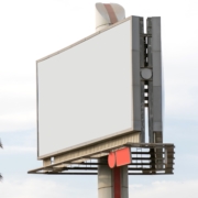
A billboard on the Eden’s Expressway, just as you join the Kennedy into Chicago.
It’s a beautiful piece of all white, real estate space where one can inform the thousands of passing cars as to why everyone should care about your product or service.
Of course, it’s not a real gift, but as an exercise in just imagining that billboard, it gets the juices flowing and makes for sweaty palms for my new clients – as big decisions need to be made! I also give them specific rules for that billboard which dictate that they can ONLY say one thing AND it has to be the fewest words possible (and visually driven too). Most people only get 6 seconds to take in the message of a billboard, so it should be succinct and grabbing. This exercise is always the most difficult of tests because my clients tend to want to say everything (and the kitchen sink).
You’ve all seen billboards that don’t follow these rules.
Headline: Johnson & Smythe Undertakers. The north shore’s leading coffin makers! Come in today to see our fabulous range! Mention this billboard and get a 20% discount!
Copy: New wood samples available. Visit our website. www.mycoffin.org Open 9-5 Monday thru Sunday. Right off the expressway! 800-MY-COFFIN. People are dying to come and see us!
Image: 14 coffin samples with pricing information (and a map!)
The passing motorists just about get time to read “Johnson” before they have to change lanes or pick their collective noses.
It’s like the owner has said:
“We’ve paid for all this space so %#%-dammit we MUST fill it with information!”
The drivers just see a blur of typography (and mahogany) and move on. A well-designed billboard can leave the viewer breathless for more. Like a tease at a strip club or a hint of a claw foot under a tablecloth (for our Victorian readers).
This is why I love billboards. You have no choice but to identify what is at the heart of your brand and say it loud and proud. Billboards are the shorthand to a brand’s soul. [It’s] the most difficult message you can write, yet, executed correctly, the most powerful summation of your brand imaginable. This is not to say that all the things your brand is dying to tell the world are not important, it’s just they need to be prioritized and kept for more viewer-friendly mediums.
The billboard allows you to cut to the chase and work out what you REALLY do as a company. I even used the billboard technique to write scripts for television commercials. When you are faced with too much information, designing the billboard gets to the core of the message. Just try doing it for your homepage!
So take a second and draw an oblong to represent a billboard.
Place your phone number and/or website address somewhere in the space.
And simplify your message.
Remember. It is less about you (and your company) and more about them (the viewer). Engagement happens when customers see themselves in your message.
TICKING CLOCK SOUND
DING!
Times up!
I told you it is difficult.
One of my favorite billboards is for Four Seasons heating and cooling. It is a type-driven message simply stating: “Your wife is hot!” with a logo and phone number.
It gives the viewer a chuckle and reminds them to think about HVAC, in an engaging way.
One example of a well-executed billboard did cause me issues, as a young parent. It masterfully used simplicity in its messaging. A coy winking girl beckoning me to visit “Babydolls,” (a gentleman’s club).
My kids were desperate to go as they were convinced it was the mother lode for Beanie Babies or at least a Beanie Baby outlet center!
“Kids, I don’t think that’s what it is selling … Hey look over there it’s a billboard for McDonald’s!”
The billboard worked too well, but for the wrong reasons.
One client asked me what my billboard would be and I showed them the following (presuming it would be the same epic Chicago location):
Headline: “Welcome to Cleveland!”
Copy: “It’s time you got your message right.”
Logo: Brandstorm
(Screech of brakes)
About the author: Phil Gayter


