5 Travel Brands With Super-Sticky Content
Table of Contents
(And What We Can Learn From Them)
These are the online travel brands that pop. They’re the ones that lure swarms of qualified traffic and keep their audiences salivating for more.
In other words, these brands are ‘sticky’.
What exactly do I mean by that? Sticky content resonates with an audience. It keeps them on your website and pulls them back for seconds and thirds. Think compelling photos, unique videos, engaging copy and ultra-useful articles.
But true stickiness goes beyond all that. The travel websites that are able to build up hordes of fans have an in-depth understanding of their audience.
To better give you an idea of web content that works, I’ve compiled a list of 5 online travel brands that epitomize what it means to be sticky. Hopefully, this article will provide you with some inspiration when creating your own digital marketing materials.
Hipmunk
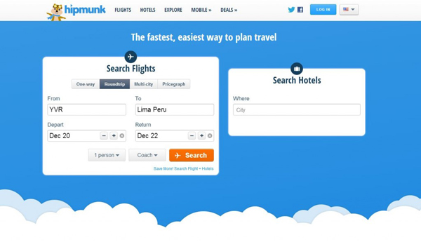
Ah, their name says it all. This OTA livens up the travel-planning process with a fuzzy mascot and light-hearted copywriting.
But this Hipmunk also has a vindictive side. You might have seen the media coverage this brand earnedin 2012 with its ‘Spite’ feature, which serves up the worst flights possible sorted by price, duration and layovers. No one saw that coming. I particularly loved the copy alongside the ‘Spite’ tab: Is the boss making you angry? Make ‘em suffer!
The company said this move was a nod to travel planners who have an “unappreciated” job. The feature itself really just displays the best flight results in reverse, but the idea was so unique and clever that it attracted plenty of attention.
Other little messages scattered throughout the site also resonate with travelers, like ditching the typical name for a ‘sort by best value’ feature and re-labeling the tab as ‘Agony’.
Hipmunk’s content is sticky because it perfectly captures how people feel while hunting down deals on flights and hotels. These guys understand their audience.
The takeaway: Create content that helps you stand out from your competition. Maybe it’s a library of amazing videos, web copy written in a unique brand voice or an attention-grabbing feature no one would expect to find on your website.
HotelTonight
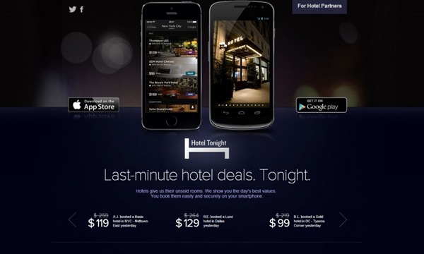
OK, full disclosure: these guys are a client of mine. But even if they weren’t, they’d be on this list. Honest.
After all, no other brand out there sounds exactly like HotelTonight. Their voice is fresh and memorable. Opening their marketing e-mails is like getting the heads up from a cool friend who’s always “in the know.”
But the real reason the HotelTonight voice works so well is that it’s not trying to be everything to everyone. Their content targets relatively young (under 35), tech-savvy urbanites who are most likely to use a same-day booking app. But you don’t have to fit that demographic to find the one-liners in HotelTonight’s property descriptions entertaining. Here’s a taste:
• Brighter and more colorful than your childhood Lite-Brite
• Luxurious Zen-like upgrades don’t cramp the hotel’s historical style
• Remember the Alamo? It’s next door
Some people read HotelTonight descriptions just for fun, even if they’re not looking to book a hotel room. It’s travel porn.
Now, if HT tried to appeal to every single person who would ever consider using their app, their unique voice would be lost. The snappy, one-line hotel descriptions would read like an IKEA manual.
The takeaway: Develop a voice for your brand that speaks to the travelers who are most likely to book with you. Don’t try to be everything to everyone.
Oyster
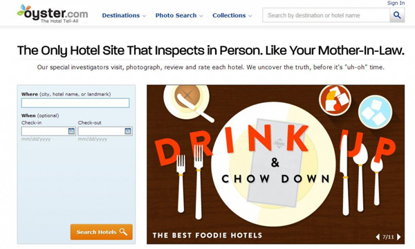
These guys are champs when it comes to homepage copywriting. They use a big ol’ benefit-focused headline and sub-headline to create a value proposition that’s both sticky and persuasive.
Their website rotates through a few different versions of the copy. My favorite: ‘You Can’t Return A Bad Vacation.’ It does a nice job of highlighting the big benefit of sifting through their objective hotel reviews.
Click into the site and Oyster continues to impress with collections of giant photos and easy-to-scan bullets points for each hotel. There’s a ton of information, but it’s easy to take in.
The takeaway: It’s important to tell people what makes your business unique – so slap it on the homepage and make sure it ‘sticks’.
OneFineStay

It doesn’t matter if you’re a doe-eyed six-year-old or a well-heeled jetsetter: everyone loves a good story.
OneFineStay certainly realizes that. The descriptions and images attached to the rental homes on their website don’t just provide information about the address and décor – they reveal the property’s backstory.
Read about how you can stay in the super-stylized home of a fashion designer now living in Paris; or imagine relaxing in the loft of an eccentric couple who’s on yet another six-month African adventure. OneFineStay uses a whimsical writing style matched with incredible photos to develop a narrative around each property.
This brand also knows that strong, descriptive copy is essential to helping travelers imagine the experience of staying in these abodes. Details are key. Here’s an example from a OneFineStay apartment description:
The look is high-end luxe, the materials blissfully sensuous. You cannot help but trail your fingers across the open plan sitting room’s exposed brickwork, the printed silk wallpaper and the kitchen’s worktop of cool marble.
The takeaway: Tell a story to better engage your prospects. And remember that well-written descriptive details can help bring these tales to life.
REI Adventures

From hiking boots to trekking adventures, this gear co-op is a well-respected brand trusted by many outdoor junkies. The REI website builds on this by positioning itself as a hub for information about travel destinations, activities and (of course) gear. So much sweet gear.
Trip itineraries are packed with beautiful photos, reviews from travelers and super-convenient gear checklists that detail what’s provided, what’s needed and what’s optional. Very handy.
REI also maintains giant collections of informative, in-depth articles and videos about everything from general travel to backpacking and cycling. We’re talking about hundreds of pages of useful content.
What’s really great about REI Adventures is there’s no hard sell. Instead, the brand positions itself as a hub for education about travel and the outdoors. That’s a great way to build life-long relationships with your customers.
The takeaway: Useful content is essential for building long-term relationships. Snappy headlines and jaw-dropping photos will snag travelers’ attention, but often it’s the more practical stuff that will earn their trust.
What Do You Think?
I kept this list focused mostly on digital-only travel brands — but there are a ton of other tourism and hospitality companies out there that are putting out plenty of sticky content.
What other travel brands do you think are sticky? Tell me about them in the comments below. And feel free to brag a little about your own content projects as well.
About the authr: Dustin Walker

Dustin Walker is a conversion-focused copywriter and marketer who specializes in the travel industry. He hates dull, uninspired web content and hopes you do too. Check out his website Jet Copywriting and subscribe to his newsletter to get more tips on how to punch up your marketing materials.


Interesting post! We were surprised with those gorgeous private rooms you just showed up above. Let us show you some new options you may consider: Over the past 10 years, vacation rentals in Costa Rica have become very popular. Vacation rentals are often the most economic travel option for families, groups of friends, and independent travelers like couples. Staying in privately-owned apartments or homes that are rented by the day, week or month gives vacationers more space and amenities at a lower price than a hotel room.
Vacation Rentals Costa Rica