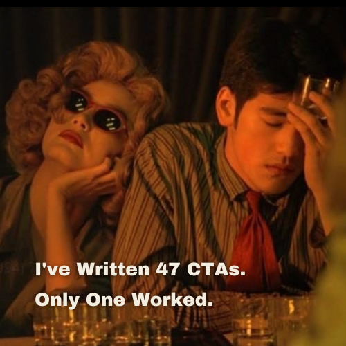
I’ve Written 47 CTAs. Only One Worked | CTA Copywriting
The document is called CTA_FINAL_v3_USE_THIS_ONE.docx. It is, of course, not the final version. It is version 11 of an ongoing argument I have been having with myself, a client, and the entire English language about how to make a stranger on the internet click a small rectangular button. It’s all about CTA Copywriting.
The button has two words. Two. And I have written forty-seven different versions of it.
Here is a sample, in roughly the order they died.
“Buy Now.” Too direct. The client thought it sounded “transactional.” The client used the word “transactional” the way a vegetarian uses the word “carcass.”
“Shop Now.” Slightly better. Sounded like a department store from 2009. Rejected for being “too retail.”
“Get Yours.” Read like a threat. Or a bingo call. Rejected.
“Discover.” Rejected by me, before I sent it, because I am not running a perfume launch in 2007.
“Explore the Collection.“ This is what I write when I have given up and want the client to know I have given up.
“Add to Bag.” Functionally fine. The client said it lacked “energy.” The bag, presumably, was supposed to have energy.
“Take Me Home.” Rejected by me, immediately, for reasons of dignity.
“I Want This.” First-person CTAs were everywhere for about eighteen months. Some say they convert better. They also make every checkout flow read like a toddler’s Christmas list. Rejected.
“Yes Please.” See above.
“Treat Yourself.” Rejected for being condescending, which it is.
“Shop the Drop.” I tried. I knew it was bad but I tried anyway.
“Find Your Fit.” Almost made it. Was killed by a Slack message that said “we’re not Levi’s.”
“Make It Yours.” This is the CTA equivalent of a wedding band’s first dance. Reliable. Forgettable. Slightly damp.
“Start Here.” The client liked this one. The client liked this one for three weeks. Then the client decided it was “too soft.” I went back to the drawing board.
I will spare you the next thirty-three. They include “Begin,” “Begin Now,” “Begin Here,” “Begin Today,” “Take the First Step,” “Step Inside,” and, in a moment of desperation I’d like to forget, “Click If You Dare”… “Hire a Copywriter Today.”
Table of Contents
The One That Worked.
The CTA that won, in the end, was three words long and said exactly what would happen if you clicked it.
“See the prices.”
That’s it. That was the entire copy. The client hated it for fourteen minutes. Then we A/B tested it against “Discover the Collection” and it doubled the click-through rate, and the client loved it forever after, and I went home and lay on the floor.
Why It Worked.
Here’s what I learned from forty-seven attempts at a two-word button.
A CTA is not a slogan. It’s not where your brand voice gets to be clever. It’s a doorway, and the only thing the reader wants to know about a doorway is what’s on the other side of it.
“Buy Now” fails because the reader isn’t ready to buy. They’re shopping. “Shop Now” fails because the reader isn’t sure shopping is what’s about to happen. “Discover” fails because nobody is discovering anything. They’re scrolling. “See the prices” works because it tells the reader the exact thing that will happen if they click. They will see the prices. There is no twist, no journey, no transformation. There is a page, and on the page, are the prices.
Every CTA I wrote that lost had one thing in common. It was trying to sell the click. It was trying to make the act of clicking feel exciting, aspirational, branded. The CTA that won didn’t sell the click. It just described it.
This is, I think, the entire lesson of writing for buttons, and possibly the entire lesson of writing for the internet, which is that the reader is not on a journey. The reader is in a hurry, they have eleven tabs open and a baby crying and a meeting in nine minutes. The reader does not want to “explore the collection”, they want to know if the thing costs forty euros or four hundred.
Tell them. They will click.
The Thing Nobody Tells You.
The dirty secret of CTA copy is that the best version is almost always the most boring one. Not boring as in lifeless. Boring as in literal. “See the prices.” “Read the recipe.” “Find a store.” “Watch the trailer.” These outperform their clever cousins almost every single time, in almost every single test, in almost every single industry.
Your brief will tell you the CTA needs to be “punchy” or “ownable” or “on-bran</p>
d.” Your client will want it to feel “ele
vated.” Your own ego will want it to be a small, perfect, quotable line.
Ignore all of that. Write the doorway. Describe what’s on the other side. Use a verb that promises one specific action and a noun that names one specific reward.
The reader doesn’t want your best line. The reader wants to know what happens next.
I have one CTA pinned above my desk now. Not as inspiration. As a warning.
We do not. We just want to see the prices.

