
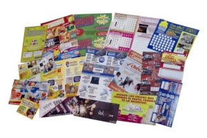
I have a love–hate relationship with expos and tradeshows. I buy my ticket with a sense of anticipation and excitement. All the things I will discover! The inspiration awaiting me behind those doors!
In reality, though, I walk around politely avoiding sales people and collecting the marketing brochures being handed out.
As a copywriter I have discovered a new delight in tradeshows. I walk around critiquing taglines, aforementioned brochures and the “today only” specials and offers.
I recall a big name home improvement and interior design show (my favourite) I went to. I was handed two brochures that encapsulated the good and bad of brochure copywriting.
This is their story.
Marketing brochures have the potential to be incredibly persuasive salespeople when you’re not there. A brochure can communicate important information about your company and products, and motivate potential customers to action. If they are done well.
This is a critique of two brochures. Not the companies or the products, but the copywriting.
Table of Contents
Let’s start with brochure copywriting analysis #1
 Firstly, the headline and tagline make no sense to me, which makes them a waste of space.
This brochure goes on to tell me this product is the “sexiest, safest, most stylish high performing system on the Australian market”. Two things really stand out in this sentence.
- A “high performing system” could apply to so many products so is really just a bit of (meaningless) hot air. It’s only when I look at the brochure’s image that I guess the product is a black solar panel.
- I have to admit feeling amused at stylishness and sexiness being promoted as the most marketable feature. I think I care more about reducing my energy bills… How about you?
Then we move onto some other features listed.
The first bullet point tells me that there are local sales reps. I’m not entirely sure what the product is but I know I can talk to a local rep. Great. The feature list ends with letting me know I can get a no obligation assessment.
- It’s important to prioritise your message. This kind of information belongs with the brochure’s call to action, i.e. ‘Find out if [product] is right for your home with an obligation-free assessment. Visit [URL] to find your closest distributor.’
The brochure talks up the latest technology in some things I don’t understand – and so don’t care about.
- This is the classic difference between a feature and a benefit. A feature is a factual statement about a product. The benefit encapsulates the advantage that feature has on my life – why I should care.
The company offers a price guarantee but I’m not sure what the price guarantee entails or what it means for me.
In summary, this brochure copywriting presents me with factual information that I don’t understand. There is jargon and there are features, but with no connection to the benefits of making my life more energy efficient. I am sure the product itself is great, but their brochure really isn’t doing them any favours.
I think this next brochure does a great job.
Brochure copywriting analysis #2

The brochure copywriting on the front summarises what the product is (glass insulation) and its most important aspects. So if I don’t read anything else, I’ve got a decent grip on what I really need to know.
The brochure copywriting on the flip side communicates their performance promise with a great graphic.
- The power of graphics and images in your brochure cannot be underestimated. They not only break up your brochure copywriting and draw readers in, they can summarise complex concepts.
- There are lots of specific percentages that add credibility to the product performance.
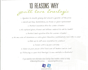
Then there are 10 reasons why I’ll love this product.
This snappy list doesn’t bore me with the technical details of how it’s made or how it works. It neatly goes through the areas I might be concerned about like installation costs, product effectiveness, environmental impacts and suitability to where I live. It’s not perfect but it’s a pretty good list.
In summary, I think this company has identified what its target customers will be most concerned about. This brochure copywriting discusses how the product overcomes those concerns in a compelling way. It talks about the outcomes and makes me feel smart for considering this option.
So what’s the point?
Brochure copywriting needs to do more than present information. Everything – from the font, colours and graphics to the copywriting – needs to engage and persuade. Remember that purchase decisions aren’t usually made on logic alone, which means features aren’t enough to persuade someone to get their wallet out.
Your marketing brochure needs to lock into the real motivators turning the cogs behind a decision, then back them up with facts and figures needed to justify that decision.
What do you think of these two examples? Am I being too harsh?
About the author: Belinda Weaver

Belinda Weaver is the founder of Copywrite Matters and copywriter behind The Copy Detective blog. If you want to be the FIRST to hear when her next copywriting master class course (so you can write better copy, faster) get on the master class prelaunch list.
Join me on www.copywritematters.com.au


Great article, I love case studies and you did that in a fun way
I only which you attach the 2 brouchors as I had a hard time figuring out what was written on each one
This article was great!
I think your pictures are swapped though – the “Back in Black” brochure photo is in the brochure #2 section, but it’s the brochure you referenced first. And the other brochure is your main photo at the top, so people have to scroll back and forth if they want to look at the brochure while reading your comments.
Copy matters but there’s another lesson to learn from this article — graphics and copy must work together. Your article has some great information but the images are in the wrong place and you can’t click on them to open the full brochure so readers can see what you’re talking about. It left me confused.