How to write copy for posters
The general rule when writing copy for posters is: “less is more”.
The executions below demonstrate great (and some not so great) examples of the art. Occasionally, a poster will need a fair bit of copy especially for something like an event (e.g. a Bruce Springsteen gig – you need to give the what, where and when but you don’t really need to sell it beyond that). But generally a poster is something that’s got to be grasped in the blink of an eye so the copy has got to be short and sharp… or non-existent (thanks Apple). Copywriter Collective have a number of professional copywriters that deliver the snappiest slogans for your brand.
See what you think of these:

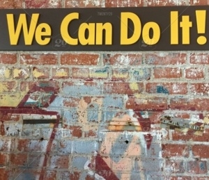
Public information posters in the UK, during the war: Strong statements.

Harvey Nicholls took almost the same line but gave it a visual treatment.

When selling, less is generally so much more…

… or just go for no copy at all.

Classic feature + benefit formula copy.

Gentle humour helps. This is a small poster on a train where people are going to be staring at it for quite a while so you might as well give them something interesting to look at and read.

Some posters demand that you give essential info.

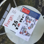
These two are absolute classics from the UK. The first is for The Economist magazine;

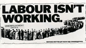
The second is a political poster during election time when the British Conservative Party was blaming the Labour government for high unemployment levels.

And finally, occasionally you can get away with writing loads even on a poster.
If you’re looking for an English copywriter to create compelling slogans for your brand, then look no further.


