What are the Best Font Design for your Website?
When it comes to making an impression with web design, there are a few elements that can be highly useful. The colours, layout, typography and fonts are some of the factors which can tell the consumers that your business is professional, reliable and trustworthy. Sometimes, people may not realize it at first, but typefaces and fonts are some of the most essential parts of web design. They can make it or break it. By using attractive fonts in logo and graphic design, you will be able to build an impactful brand identity and represent your business in the best way possible. If the font styles do not appeal to the eye of the visitor, or they are not legible then your visitors might turn away from your website and move on to another option. In order to avoid such a situation, you can check out some of the best fonts in web design here and make the right choice.
 Arvo
Arvo
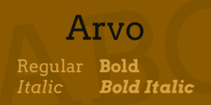
This is one friendly, slab serif font that you can use in headers, sliders and descriptions as well. Arvo was created by Anton Koovit and can be availed freely on Google fonts. It attracts the attention of the visitor instantly due to its bold and artistic appearance.
The readability and versatility of the font has and is making it a popular choice for web designers. Arvo is easily paired up with any Sans Serif font. This can enhance the overall design of the website and engage the audience. If you take a look below, you will see that the fonts are used in multiple ways in web design. For instance, in the header as well as in the content or navigation bar. It is not only legible but also appealing to the eye.
Lato 
The Sans Serif font design is known for its professional and clear-cut look. Lato has been in use since 2015 and has become quite a popular font style with 9.6 million websites using it. This font can really make a strong impact on visitors. The style conveys the message of business and brand in a clear and no-nonsense manner.
The professional and rounded appearance of the font shows stability and reliability. However, it sends out a message of familiarity as well. If you are running a home décor business or an advertising firm, Lato would work quite well in your web design. This is because it has that modern touch and clarity that is a signatory to interior design or décor fields.
The best part about this font is that you can pick a style from thin to bold. This is great for using the font for titles, sub-headings and testimonials.
 Playfair Display
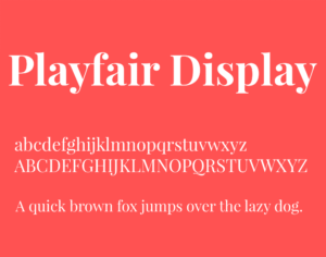
This Serif font design is highly appealing and makes for the top choices in web design other than Times New Roman and Garamond. While typefaces in the Serif family are considered to be traditional and timeless, the font style has stood out for being unique and elegant.
Playfair Display was created in 2011 and does take inspiration from classic print letterforms from the 18th century. Its soft and slightly italic design brings out feelings of positivity and nostalgia. The font can be ideal for business websites of graphic designing firms and organic food brands.
Merriweather 
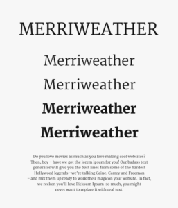
Interestingly enough, the font was designed to be displayed on screens. The font makes it easier for people to read through web pages. Merriweather is a Serif font style that made its way into web designing during 2011. Designers commonly use it as it’s highly readable in various screen sizes. Despite the classic appearance of the font, there is something quite modern and contemporary about its appearance.
The bold letters can catch the eye from the first look and have a strong impact in web design. With its sophisticated appearance, Merriweather can be a good choice for clothing brands, technology companies and digital services. For example, project management and software installation.
 Amatic SC
It is a one-of-a-kind font that has been making waves in web design for its hand-drawn form. The playful feel that comes with Amatic SC has led it to become one of the choices in web design for headings, titles and even body text of websites that feature younger audience like early learning schools, daycare or even arts and craft website designs.
While your regular audience cannot miss it anywhere and might be convinced to explore more on the website. It is not a font for professionals. If you run a dating or flower shop website and want to engage your customers with a fun quiz or questionnaire, this font might be the right pick for it.
 Open Sans
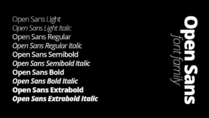
The Sans Serif font design is a popular pick for several website designer and developers. This is because of its clean-cut look and flexibility. It can basically be used in everything from the main headings to navigation bars and footers. Due to its minimalistic appearance, Open Sans can be ideal for restaurant websites, design and advertising web pages as well as websites for magazines.
If your website targets professionals and businesses then Open Sans font family is the best choice for clear and legible website text.
Looking for a copywriter? Contact Copywriter Collective today!
These are a few of the top choices of fonts that you can find in web design. They can work quite well on various websites and can attract consumers in a highly competitive market. You can choose anyone which aligns with your brand identity. You can also experiment by pairing up different fonts to improve the user experience on your website.
About the Author
Kris David is a student by day and a wordsmith by night, Kris David works as a freelance blogger. He is currently pursuing a degree in Communications and relying on his freelance gigs to jumpstart his career in journalism.
 Web Design-copywritercollective


 Social Media Strategies-copywritercollective
 SEO-copywritercollective